Case study01 / 04
Rueya
Named, designed and built a store for wallpapers, presets and guides. Brand, shop and checkout by one person.
- Services
- Brand, Product, Design, Frontend
Brief
Rueya Supply sells digital goods for the screens people live with: wallpapers, presets and LUTs, guides and bundles, downloaded from a personal library.
Rüya is Turkish for dream. The line under the name, “Dreams built with logic”, became the brief: monochrome, printed grain and exact type, so the colour belongs to the work on sale.
Mark
The r is built from a single stroke width and checked on a grid of half that width, so it stays exact from a favicon to a Studio Display.
- Stroke
- One width throughout. The arc is two strokes tall.
- Cut
- Under a third of a stroke, so the r reads as one.
- Curve
- Pushed past the dashed circle so it reads round.
Identity
Monochrome, a printed grain and a tight grotesk wordmark beside the r. Every surface stays neutral so the products carry the colour.
Waitlist first
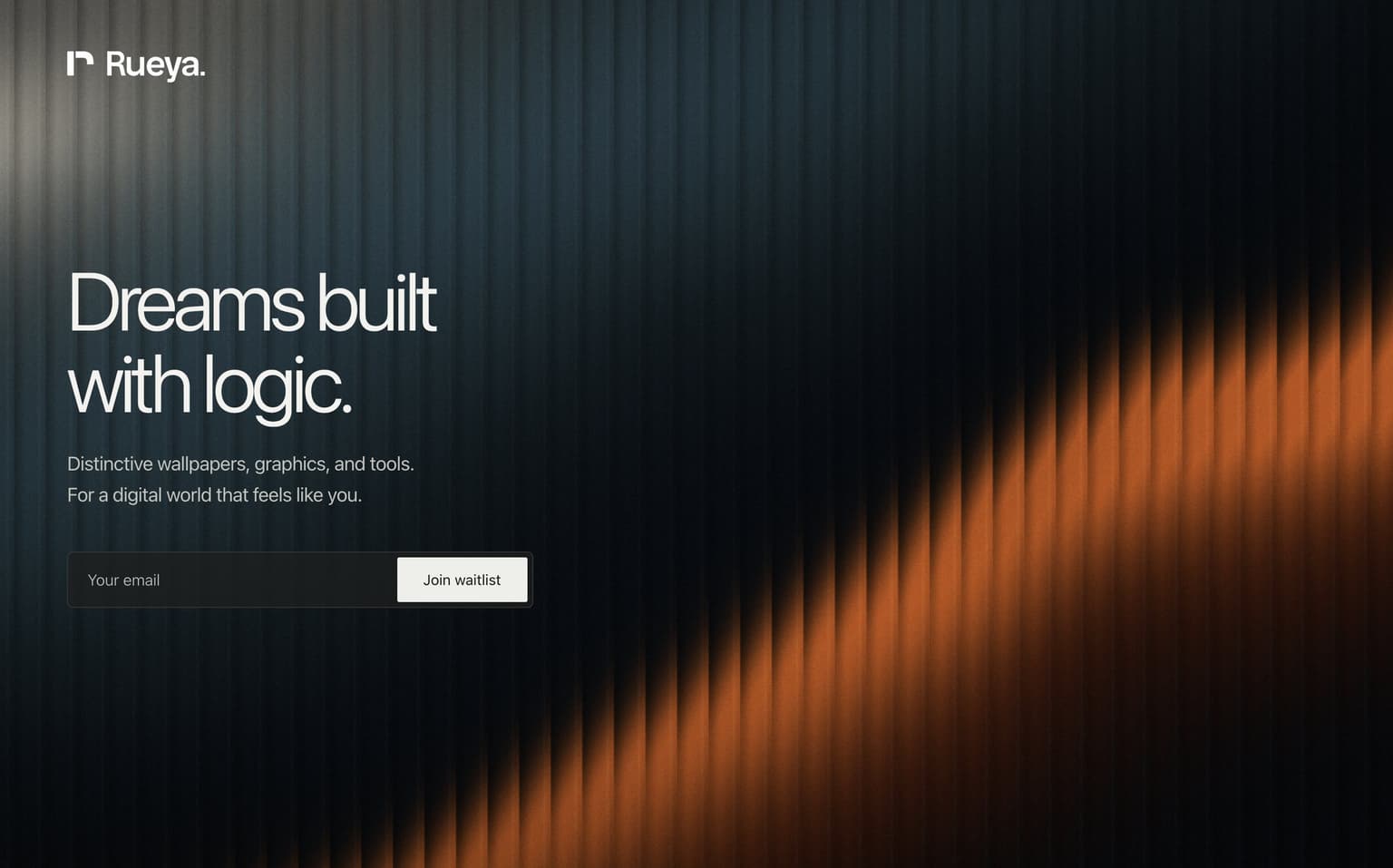
Before any product, one page: a line, an email field and a light that moves. It found the first audience and tested the voice.
Store
Every pack is previewed on the device it is made for, iPhone, iPad, Mac or Studio Display, so choosing a wallpaper is seeing it.
Checkout and library
Accounts, orders and downloads on Nuxt and Supabase, with in-house invoice and email kits so every receipt carries the brand.
Outcome
- Person, from name to checkout
- 1
- Product lines
- 4
- Devices previewed
- 4
- Name, identity, store and back office designed and built by one person
- A legal invoice and a branded receipt generated for every order
More from the build
5 more images, select to enlarge
Story. Rüya is Turkish for dream. Collection. Three packs, three displays, one price. Search. One field, one filter, one result. Account. A personal library, in the brand’s grain. Footer. Every page closes on the wordmark.
 Next projectVitrum